by Daphne Thompson, on Jan 18, 2017 10:43:49 AM
Microclimates exist in several areas around the globe and can result in massive impacts for cities and agriculture alike. Growers understand that in order to properly manage their fields for growth modeling, irrigating and disease modeling, they need to know the weather on that field.
Typically one has to view a map of surface weather stations and analyze what’s going on.
Yet another ice storm heading for Portland, OR today. Setup is always fascinating. pic.twitter.com/cvz5pmwWU2
— Anthony Sagliani (@anthonywx) January 17, 2017
Wouldn’t it be easier to graphically show that temperature data and rainfall data?
WDT’s Insight API does just that. In the GIF below of hourly surface temperature, one can see a remarkable weather phenomenon.
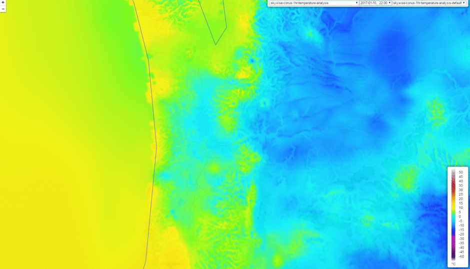
Portland, Oregon, located near the center of the GIF, is about to experience a freezing rain event due to the Columbia River. One can see how the cold temperatures (in blue) funnel in along the river from right to left and spill out towards the coast line. The blue areas indicate air below freezing. Notice that the foothills, which are at a higher elevation, show up in green. This means they are warmer than the river valley and the area below. A map of single surface stations cannot accurately capture the phenomenon everytime, meanwhile gridded 1km data clearly show it.
Besides temperature data, below is a 24 hour estimate of rainfall for January 19, 2017 from the insight API.

The temperatures should remain below freezing for the event, due to the cold air coming in from the cascade mountains and the river, resulting in a freezing rain event. Using Insight API, one can quickly and easily create visualization tools and power analytics engines to help your customer prepare for whatever Mother Nature throws at them; including microclimate effects due to terrain. Give us a shout for more info!