by Matthew Stevens, on Sep 21, 2018 11:19:58 AM
The WeatherOps platform features many forecaster-influenced components that help our clients better understand and respond to weather threats. Our meteorologists utilize various forms on the admin side of WeatherOps Commander to enter text, imagery, and other content that is ultimately consumed by end users.
When set to the task of developing a new form for our WeatherOps forecasters, we wanted to put ourselves in their shoes. We enjoy using thoughtful software, so we created something that was user-friendly. One of the things that stood out to us during our planning phase was how much time our forecasters spent looking at screens. As developers, we have many different themed code editors designed to elevate eye strain. To us, it was a no-brainer to include an option that was easy on the eyes, while still giving them the choice of a traditional light theme.
Below is a quick overview of what Styled Components supports and why we decided to use it.
• No build requirements
• Small and lightweight
• Supports global CSS
• Supports entirety of CSS
• Isolated
• Doesn’t break inline styles
• Easy to override
• Theming
• Server-side rendering
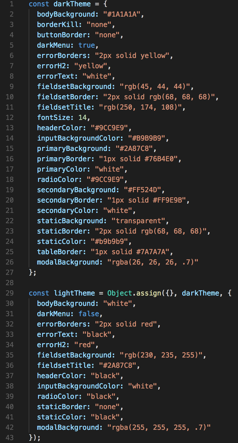
On render, state triggers a function that checks to see whether there is a theme stored in the client’s local storage. If there is no theme set, it defaults to the light theme until a dark theme is selected.
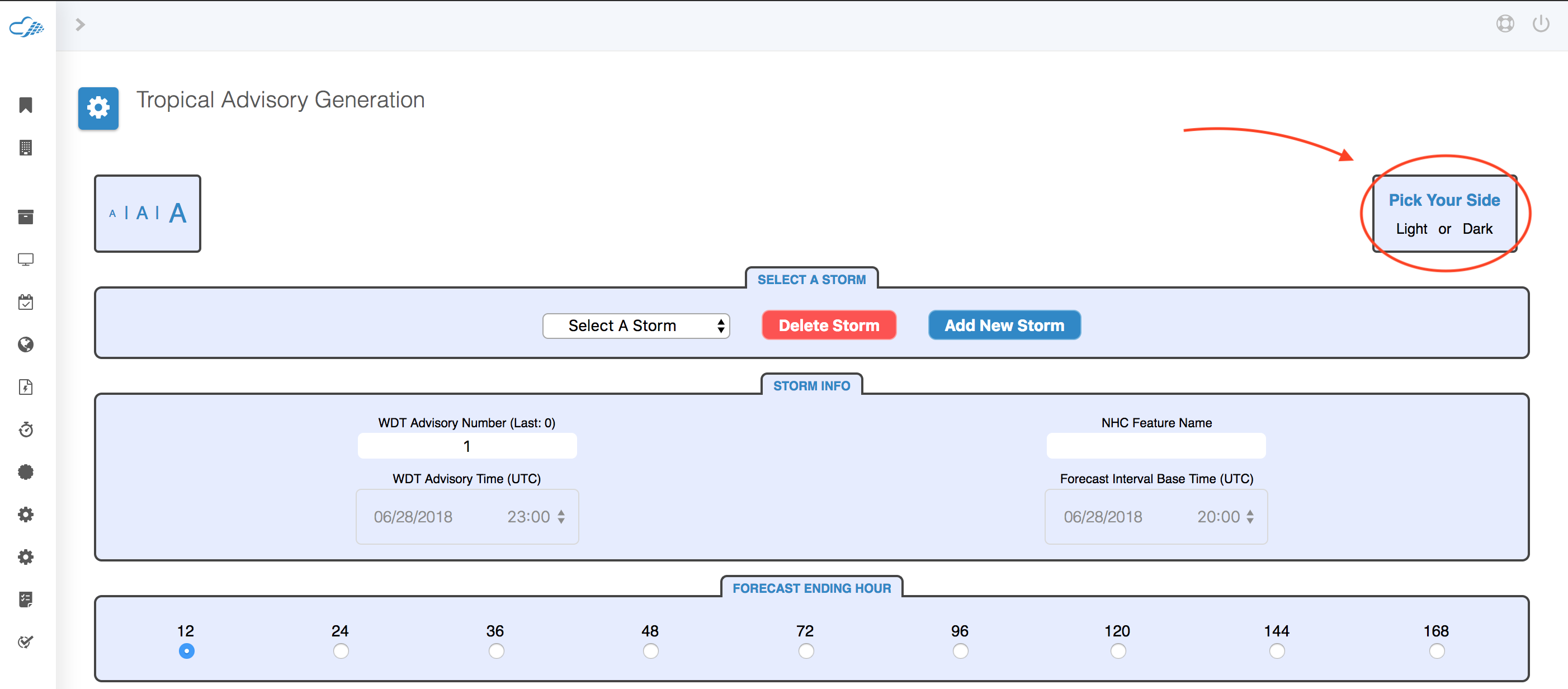
Below is a snapshot of the two themes that can be toggled.
In Styled Components the documentation looks like this for pointing back to what value you assigned for a particular theme. 
We wanted to simplify this a bit for our use-case, so we created a helper function that looks like this:
It allows us to give values to our properties we create that looks like this: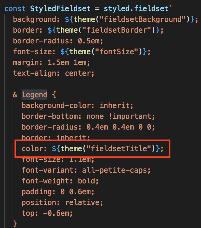
By setting up our theming with styled components, we are saving time in the future if we ever go to add a theme or edit the current ones as changing one themed value makes the necessary changes site-wide. Using this for the first time was straightforward and easy to pick up as Styled Components is just CSS and JavaScript.
We’ve had success at adopting Styled Components for our project, and recommend React teams that are not familiar with it to check it out and see if it could be a useful tool for them.