The Pressure of Using High Resolution Data
by Ben Baranowski, on Dec 10, 2015 10:25:00 AM
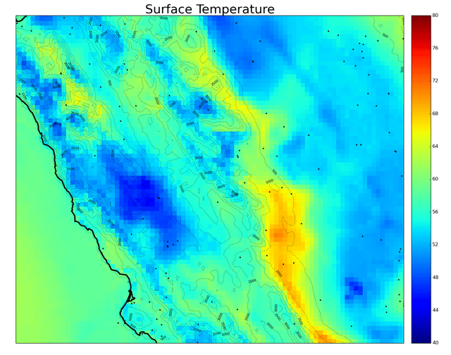
WDT is working to build a very high resolution, gridded surface observation dataset that provides customers superior data over simply using standard station observations. The SkyWise Surface Analysis Archive will be launched on 01 March, 2016 and will initially provide data for the U.S., with other regions to follow soon after. High resolution GRIDDED data is critical for communicating weather information owing to the sparse nature of observing stations. The plot below shows the standard observing stations (black dots) overlain on WDT’s high resolution temperature grid.
 Note how the lowest and highest temperatures contained in the gridded data are not located with a black dot, and therefore would not be noticed by people using only the observation data. Sometimes though, these high resolution data sets make you take a step back and scratch your head.
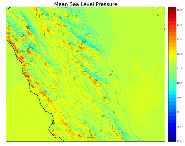
Below is a plot of mean sea level pressure (shaded) with terrain contours (dotted).
The first thing we noticed was that the sea level pressure looks a lot like the terrain and that this is likely a problem. If one were to plot the actual pressure recorded by weather stations, these data will look a whole lot like terrain, since pressure decreases with height in the atmosphere. This is why meteorologists use mean sea level pressure; we remove that terrain sensitivity. There is a simple formula for removing that terrain influence from the station pressure, but since the mean sea level pressure plot still looks like terrain, we must have done something wrong.
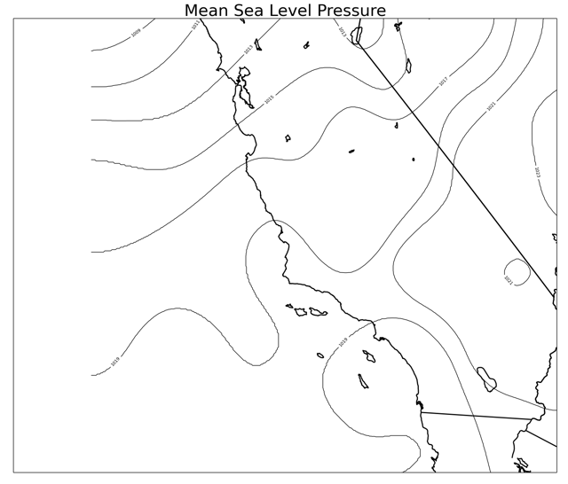
So, we debated about what could be wrong and why it didn’t look like we thought it should. After a lengthy discussion, we came to realize that rarely, if ever, do we look at pressure data at such a high resolution. The data we use to diagnose high and low pressure areas have grids with data points every 20 or 30 kilometers, not every few kilometers. So what happens if we take our high resolution data and put it on a grid we’re more used to seeing? The result is show below.

Much Better! So the high resolution sea level pressure data are correct, just not what we’re used to seeing. If these data sets are making us reevaluate the way we interact with them, imagine what it can do for others!


